ffmprovisr gets a redesign
31 Oct 2017Introduction

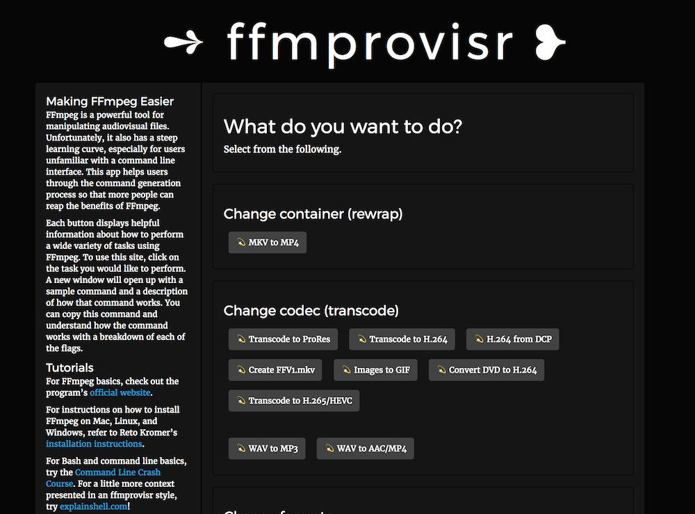
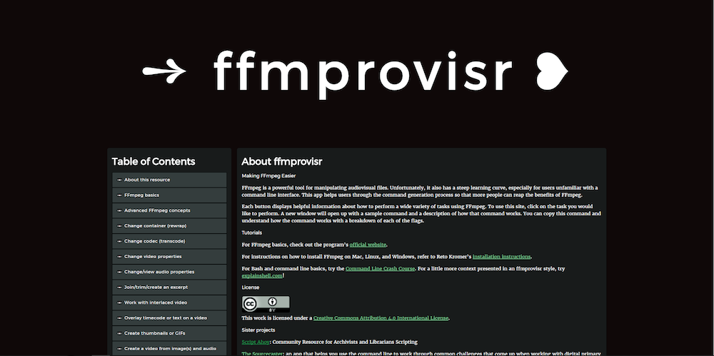
If you haven’t been to ffmprovisr in a while but check it out right now, you’ll notice it recently got a makeover (go check, we’ll wait)! ffmprovisr has been looking the same since its initial inception over three years ago, as I recently noticed while looking through old images. The most noticeable difference, at first, is going to be some of the visual changes, but ffmprovisr actually got a full, comprehensive redesign in terms of an information architecture overhaul, lightened codebase, better handling of different screen sizes and improved design/animation for an overhaul better user experience.

So, what changed, and how?
Here is Katherine Nagels to introduce some of the initial changes…
Organizationally
About a month ago, I realised that ffmprovisr had grown so much that its navigability was now a bit lacking. At the beginning of October, we had almost 80 (!) recipes, grouped under 10 different headings. Some of these categories, such as Change codec (transcode) were clear and accurate, but others were less useful: for example, the Other section of miscellany had grown to 20 recipes, whereas we had a solitary entry under Repair files. Would someone looking for a way to synchronise audio find the latter recipe? Likewise, some groupings didn’t seem all that conceptually tight to me: the Make derivative variations category included recipes for making animated GIFs, ISO creation, and trimming video.
I set out to reorganise the page by creating new headings, renaming others, and moving around the recipes accordingly. To give several examples: all the commands to do with trimming, joining, or excerpting a video now became grouped together under a heading of that name; Work with interlaced video was another new section. Change formats, a name which I found quite vague, became Change video properties, as that section groups recipes with which one alters things like a video’s aspect ratio or colourspace.
So far, so good. Or was it? Actually, a lot of these decisions weren’t as trivial as they seem. Classification and taxonomy are big concerns in library and archival world, and they proved to be sometimes tricky even on a small-scale project like this. For example, did the recipe Images to GIF really belong in its original home, the Change codec section? (We decided it did not). Should all the audio-related commands be grouped together in one section, or should we separately retain the Normalize/equalize audio section? (We currently have combined them under the heading Change or view audio properties).
These changes were a process rather than absolute actions; for example, I split out recipes for creating thumbnails and recipes for creating GIFs into two separate sections before more sensibly bringing them back together under the umbrella of Create thumbnails or GIFs. Conversely, we added the entry on filtergraphs in a section called FFmpeg concepts before realising that we were presenting a pretty advanced topic as something of an entry point - not very beginner-friendly. (Thus the FFmpeg basics and Advanced FFmpeg concepts sections were born). This is also a good example of how important the review and feedback cycle was to these changes - it’s easy to get lost in one’s own viewpoint.
The main idea I tried to keep sight during this reorganisation was simple: what would make ffmprovisr a better resource for beginners? Not that it’s not useful for more experienced people too, but as I emailed Ashley recently, I love the idea that people, even from outside archives, could find ffmprovisr and learn how to use ffmpeg from it. Applying this concept to page structure meant that steps like adding a Table of Contents were obvious. But it also provided a good opportunity to fill in certain blanks, like adding an entry describing the basic structure of an ffmpeg command, and a generic rewrap command. I know from experience that unfamiliar and/or technical things can be intimidating, so I’m all about lowering the barrier to entry for such a useful and extremely learnable tool as ffmpeg.
Now at 30th October, we have 18 categories and, if I count correctly, 84 recipes - including just 7 in the Other category. ;-) There’s always a tradeoff to be made re: granularity v. efficiency, but I think the current balance is pretty decent. There is always room for improvement, of course, so feedback and contributions are welcomed!
Of course, usability is about much more than just the structure of information - visual design and user experience are even bigger pieces of the puzzle. Over to Ashley to describe how she refactored ffmprovisr visually, as well as cleaned up the codebase!
Structurally
ffmprovisr was built on Bootstrap and not optimally sized for smaller screens other than what Bootstrap inherently delivers. It was also built relying on Bootstrap’s Modal feature and used some of Bootstrap JS to perform some magic associated with that.
I’m really obsessed with removing Bootstrap from projects (for some reason) and even more obsessed with replacing it with CSS Grid Layout. I like CSS Grid because it’s the “hot new thing”, but it’s the hot new reliable, well-supported, built-into-the-CSS-specification thing, so it’ll soon grow to become the “stable new thing” and stay that way. It feels really great to remove a large framework library and replace it with just a handful of lines of code.
I also really love extracting jQuery out of projects but I ended up not doing that with ffmprovisr, even though there is very little JavaScript used on the page. It is used just for ensuring anchor tag reliability and updating the site – some more work needs to be done there, and you can take on that task if you want to contribute! There is some reliable but inelegant JavaScript currently keeping it in place.
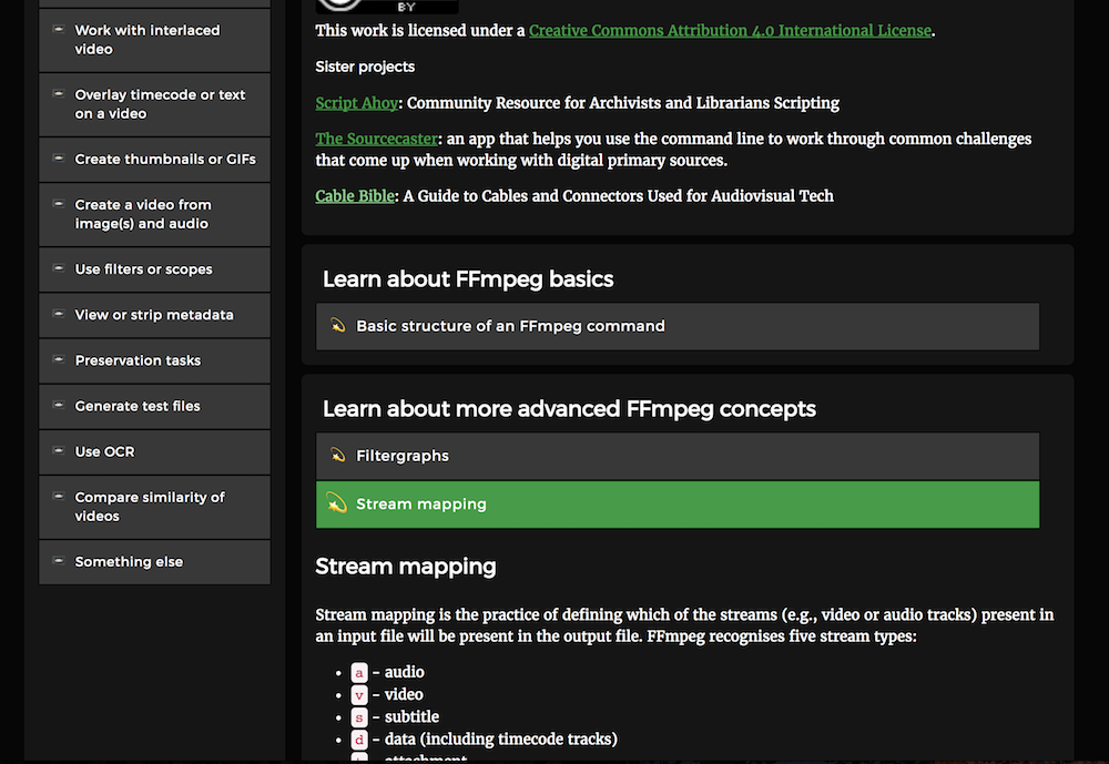
The first thing to go in this redesign was the Modal view. I replaced it with an inline collapsing open/close functionality instead. I initially and temporarily did this using Bootstrap while I got feedback from the community/fellow maintainers and then replaced it with pure CSS. This way, people can browse through the rest of the site and open multiple scripts at the same time, which wasn’t possible before. Also, modals just aren’t very good, so I was happy to be rid of them.
Visually
All of the above changes inevitably caused the site to be changed visually. The Table of Contents section was new, for instance.
After adopting Grid Layout, we were able to make portions of the website resize themselves based on size of screen. For small windows, like on a phone, everything will appear in one long column. For windows with more space, the Table of Contents will appear on the left. For very big screens, there is some space on the right and left so the content isn’t stretched too far across the screen, which would make it hard to read.
The font size increased a little bit and we switched from using pixel sizes (which do not change) to using em sizes (which change in relation to the default screen size). The main header, where it says ffmprovisr with some swirly unicode, is using the vw size. If you resize your browser window, you’ll see that the header automatically shrinks at every step. This is how vw works, it is a size calculated based on the “viewport width” (and the viewport is your browser).
Next, ffmprovisr used to have buttons that would open up modals. After modals were removed, as mentioned above, it was visually less appealing to click through. The content would appear immediately under the button, with other buttons dangling around “in the air.” The buttons were replaced with rows that light up as green when hovering, and the grow-the-icon-slightly-bigger animation feature was maintained but re-written.
Since these big changes, Katherine has come back around to fix some things that needed improvement, especially related to media queries and some CSS sizing. Thank you Katherine! It’s great to have such good teammates to collaborate with on these kinds of projects.

Conclusion
Those are our improvements! We hope that all these changes make ffmprovisr easy to use, which in turn will make ffmpeg easier to use and understand, not just for archivists but anyone wanting to improve their skills around this powerful and valuable open source tool. There are a few more small improvements that can be made, and if you want to learn to submit your first open source pull request, please get in touch with us and we can help you!
Thanks always to fellow maintainers Kieran O’Leary and Reto Kromer, and everyone who has submitted contributions to this project.
