rsync, GUIs, power, control, design, and decisions
29 Jun 2019I spent last weekend making a GUI for rsync (and this past week tidying it up a bit) and I learned a lot about rsync, GUIs, design, power, control, and decisions around verbosity and freedom of choice versus simplicity and guidance/support, packaging, maintenance and support.
A long time ago, I put this question out into the ether – Archivists: What is a simple task you do for which you wish there was a GUI? Please help steer my personal development projects. And, like, I guess Ethan Gates is the winner because making a GUI for rsync seemed like a project 1) within reasonable scope 2) useful for people and 3) the type of thing that I’m into, philosophically. So I am going to talk about all those things in this blog post!
rsync
I’ll note that Ethan wasn’t the first person to ask about an rsync GUI, although Ethan is similar to me in that his work focuses on many sides of the 20-sided die of digital preservation, distillable down into a binary of technical knowledge and people knowledge. Other people have asked me for an rsync GUI but haven’t heard of or used rsync, but what they want is a way to move files from one place to another with confidence, with fixity, and have the assurance that the files made it there. They want the preservation elements of rsync but they don’t know that those elements exist.
Successful UNIX tools (or any tools, for the most part) are the ones with a simple concept manifested very thoroughly, and rsync is certainly that. What does rsync do? It copies files, simple as that. What does rsync also do? It allows you to copy files across systems, it preserves technical metadata like timestamps, it knows how to look in a couple directories and only move the “new” or “changed” files, it uses checksums to verify the files have moved from one place to another, it gives the option of preserving hardlinks and/or softlinks, and many other things. There are over 100 flags in rsync that you can select to do different things. So, this is what I mean by doing something simple, and doing it very well and very thoroughly.
People like one-click answers to their problems though, and don’t need to think about most the the rsync flags, and this is what I started to grapple with when making this GUI.
GUIs and Design
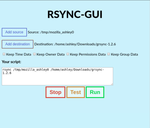
I’m speaking of design in this case about how things look as opposed to how systems act. There are a lot of ugly and confusing programs out there. But I believe an easy-to-understand (strong UI/UX) but ugly application is better than a slick-looking confusing or dark-patterned application. But having both is the best of all! A large reason why I picked Electron was because of the native browser aesthetic – people are familiar with HTML elements and working with them more often, these days, than the “native OS” look-and-feel.
Another reason I picked Electron is that the documentation is very good. It helps that I’m already very familiar with a web-based stack, but good documentation is what really drives this home. I appreciate the effort put into making clear and easy to understand docs, along with lots of examples on how to put these things in action. Being able to debug in the console is a benefit, too, and getting up-and-running with Electron is extremely simple. As this project really is 95% visual components and 5% underlying processing, Electron is a great fit.
People complain about Electron a lot, but the primary complaint just seems to be that its bloated – carrying an entire browser engine along with something small. But like, all of our computers are already bloated, and there’s at least a 40% chance that right now I am bloated, and it doesn’t mean you should love me any less, and I think the above points I’ve raised override the lack of svelt-ness of the program. People don’t care that an application is a streamlined 3MB or a big round 200MB boy – they care that it works for them and it makes them feel good about using it.
Tools that teach
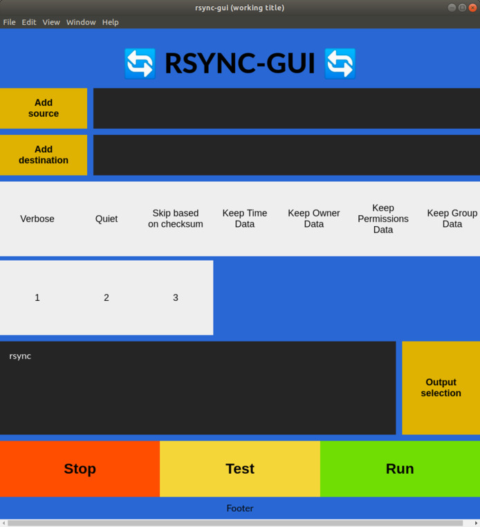
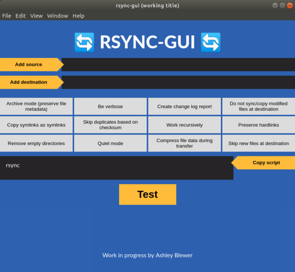
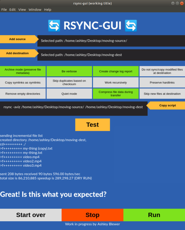
It’s zero surprise to anyone who knows me that I’m somewhat obsessed with empowering users to have the knowledge to make their own choices and decisions by helping people better understand the software that they use. I think this project helps with that in general, but there’s a lot of work into thinking through how this application can be not just for helping people solve the problem of “I need to safely move these files from here to here” but also “I want to understand what happens when I run this command, what my other options are, and give me confidence that I’m doing the right thing.” This is why I dedicated screen space to visualize me making the command, and people could use that command on their own without the GUI, and time spent on making tooltips in order to expand on the brief knowledge conveyed on a button (Update: ended up not working with tooltips and instead made the flags self-describing, but I may go back on that at a later stage). I want to allow users to go beyond “What is Archive mode? Sounds good, I guess I should use it…?” I also think setting the application up with recommended defaults is a good way to convey expert knowledge without being too pushy about it (“Archive mode is selected when I open the application so I guess it’s recommended.”)
Power and control (P.A.C)
It was very soon after I had a working prototype (and I spent 90% of my time on
the aesthetics, because making it work is relatively trivial – just call
rsync!) that I started to get nervous in a weird way. rsync is a powerful
tool, and it’s powerful enough to mess up a computer. Should people have that
control? Would this accidentally destroy someone’s server? Is rsync better
only on the command line for a reason? I don’t usually have to grapple with
these gatekeepery thoughts, but when I was clicking around to add random folders
and hitting the “run” button (I had hardcoded --dryrun into it), it still
scared me!
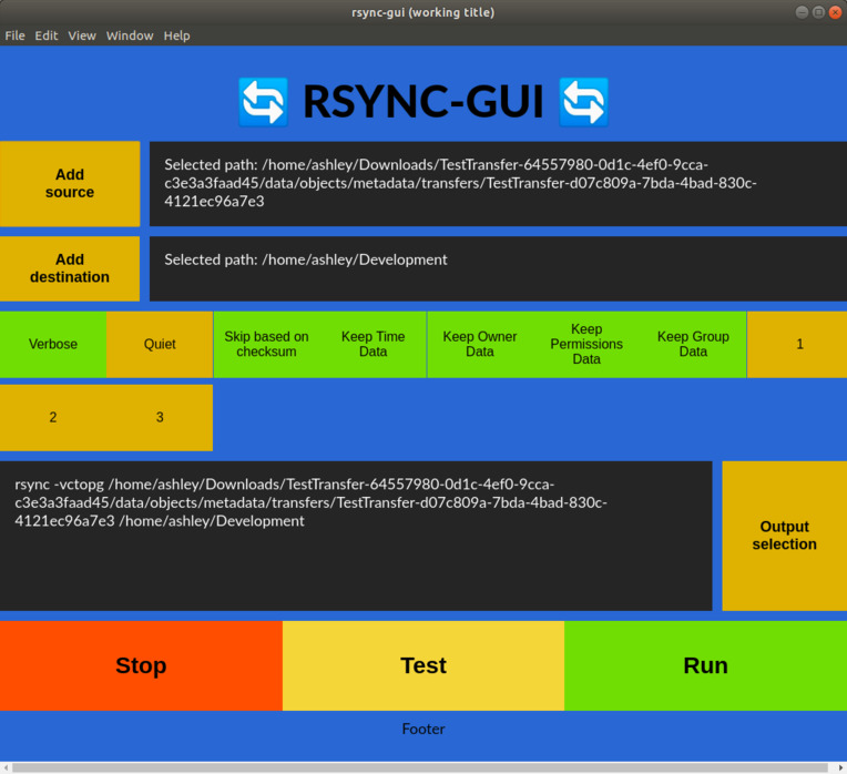
I know from building software that people don’t read (as in, I don’t read instructions on how to fix my own problems, but also sometimes I have to fix problems in which someone was technically ‘warned’ through the app as to what would happen – again, though, I think this comes around to building good, friendly, and clear design). What kind of (supportive) barriers can I put up, such as forcing a dry-run and getting the user to confirm that that is what they indeed want to do afterwards? Is that too much hand-holding? How do I make a tool seem non-scary to counteract years of people being treated like “non-technical imposters” but at the same time confirm that there is a lot of power and they should weild it appropriately?
Designing for users
With all of the above in mind, I thought through: how do I balance these two things?
- Verbosity but freedom of choice
- Simplicity but restricted guidance/support
I read the top answer on this off-topic question on StackExchange Server Fault that is summarized by “Finally, I would say that rsync is just too freaking complicated. Anyone I know who uses it regularly has a pre-set group of flags that generally does what they want”
Is it better to make up common rsync “recipes” for people to use, or is it
better to let folks have access to ALL of the flags (I counted, there are a bit
over 100, so probably not 100 checkboxes) and pick’n’mix what they want? What
even happens if I select both “verbose mode” and “quiet mode”? (Answer, quiet
mode “wins”, although I assume if there’s an error you’d get a real big one.)
One hundred checkboxes sounds like a UX nightmare and a nightmare for me as the
developer/designer, so maybe just the major boxes? Or do I just make up recipes?
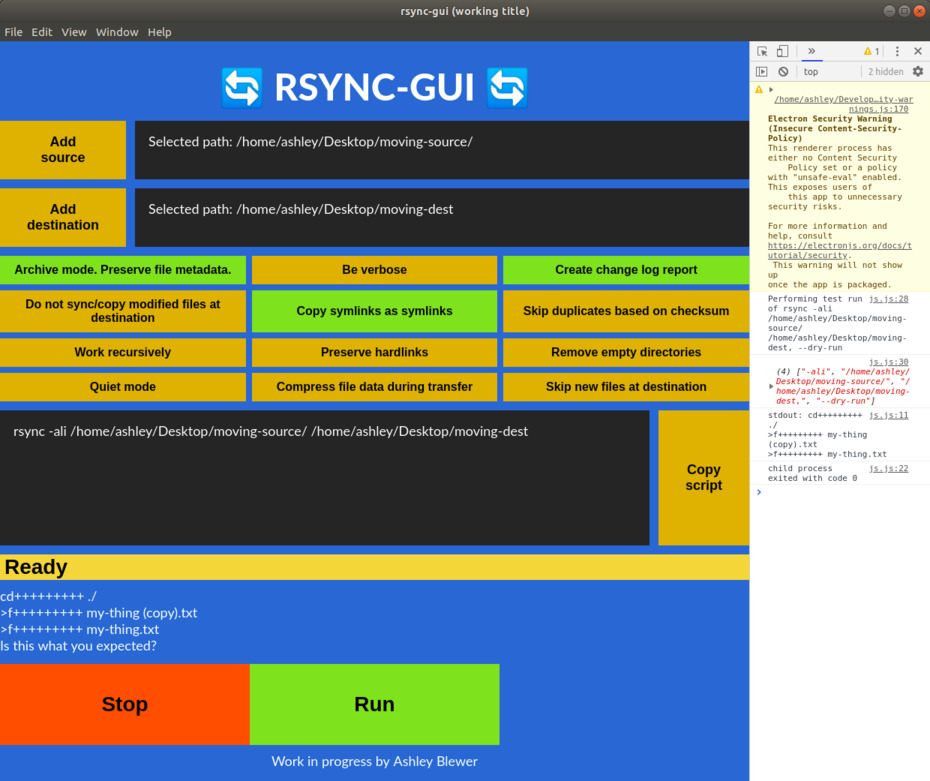
I started off in the middle – most significant flags, and then presenting advanced
flags under an advanced options box that is closed by default, but now I am
leaning towards “recipes.” Although I am wary of this just because I am not an
“expert” in rsync. Again, what is guidance and what is too much hand-holding?
Maybe an “advanced/custom flags” option would let me feel better about putting
in a more limited set of checkbox options. (And these questions have technical
implications too – am I building checkboxes, radio boxes, toggle buttons, or
what? It drives home the importance of having a clear design system in place
and clear ideas in place before typing up the layout).
Packaging, maintenance, testing, and support
Right now, this app “works on my machine.” But the weekend is coming to an end, I have a lot of other things to do, and so we’ll have to see if I can make it the final leg of the journey – the longest leg of the journey because it stretches out over a long period of time, relies on other people somewhat, and is just “less fun.”
Thinking of something to make is superfun, making something is fun, and shipping the thing is that final mile that isn’t fun. The gap between the first, sometimes the second, and especially the last sometimes sows a lot of weird jealousy when people think “Hey, I thought of doing that, and I could have done it much better” and don’t finish up the thought with “…but I didn’t.”
The final mile for this project is packaging and testing. I picked Electron because it was a way to deploy to all major operating systems, and I think it’s important not to leave anyone out (I feel like someone is always being left out – often Windows users that need this kind of bridge, sometimes Linux users, sometimes macOS.) The biggest hurdle here is going to be testing on Windows, which does not natively come with rsync. Also, I’m not a Windows user and I’m only familiar with the basics of doing CLI-style stuff on Windows (only enough to teach beginners about the command line, basically). It’s easy to label something as complete when it works for you, but it’s important to make sure it works for other people, especially people that are different from you. I mean in terms of the technical stack they use, but also their ability and understanding of how something works is vastly different from the person who created it.
So, I haven’t gone this final mile yet. I hope that this public blog post will motivate me by guilting me into finishing up the project, taking time to find and test with users that fit what I think is the use-case, and incorporating that feedback into what will initially and inevitably always be just a proof-of-concept project unless I do these things.
Additional concerns and conclusion
- Something I thought about but not within the scope of this blog post is “How to get to minimum viable as quickly as possible?” as a development strategy.
- The images are my design process, moving backwards, with the first image being the current iterations and the last image being the first.
- You can view the source code on Github, here, or run it yourself!
- Any ideas for a cute name?????????????
As always, please direct any comments to the Issues page or to me directly!
